
Overview
The most powerful way to analyze rates and visualize rates. The Rate Analysis page allows you to break down with granularity basically any way you want to look at current rates or trends going back to 2018. It’s designed for maximum power and flexibility so you can do the analysis you want. Whether you need to understand how a single facility or operator handles rates in a market, build a custom comp set on on a deal, or compare how various operators compare to each other in a market, you can do it in the Rate Analysis page.
Whatever custom breakdown you create, you can export it and bring it smoothly into Excel or wherever you want to build your full model.
This article walks you through where to find the chart, how to customize it, and how to build custom facility groups to compare rate performance side by side.
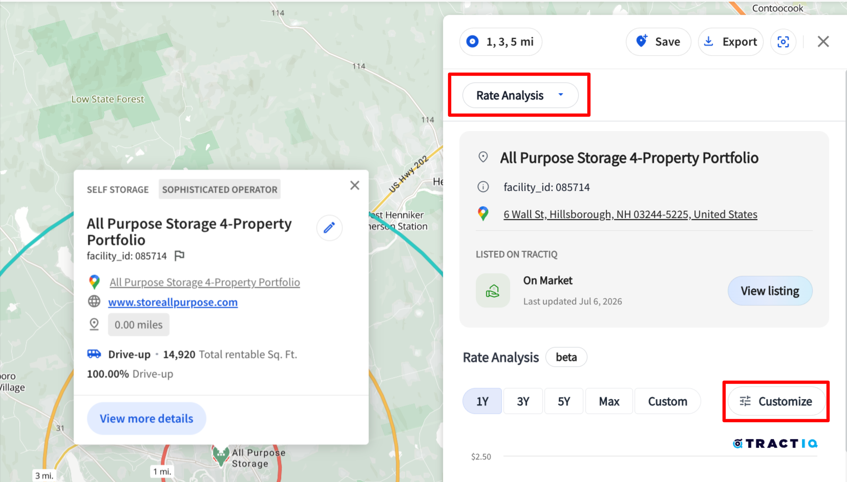
Getting to the Chart
- Set your location — select a pin on the map, enter an address, or drop a pin anywhere you want to analyze
- Open the Insight panel and click the dropdown arrow
- Select the Rate Analysis option
- Click the customization button to open the chart in its own dedicated page
The chart loads preloaded with all unit sizes, ready for you to start shaping.
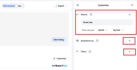
Building Your View
Once you're in, the panel on the right is your workspace. This is where you set your criteria and layer in filters until the chart shows you exactly what you're after.
A few of the things you can control:
- Distance — set the radius for your trade area
- Rate type — toggle between street rates and web rates
- Time frame — pull a different month or a different year
- Filter sets — layer in unit size, climate control, level and access, individual facilities, management types, and facility sizing
Mix and match these however you like. The chart is built to be flexible, so lean into it and see what the data tells you.
Creating Custom Groups
This is where the chart really opens up. Custom groups let you bundle facilities together and plot each group as its own trend line, so you can stack them up and compare rate performance head to head.
Here's how it works:
- In the filter or breakdown panel, choose to create a custom group
- Click Add to Group, then select the data criteria you want in that group
- Repeat to build out as many groups as you need
- Click Apply
As an example, you might build three groups: one for all the Extra Space stores in a market, one for all the Public Storage locations, and one for a single Morningstar site you're using as your subject property. Hit apply, and each group collapses into a single trend line; every facility's monthly rate averages rolled together.
Now you've got a clean, side-by-side picture of how each group is performing on rates within their relative market. Your subject site, the national operators, whoever you want to line up against each other.
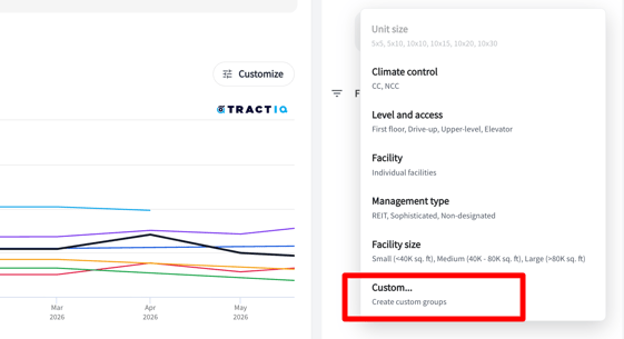
Layering in More Filters
You're not locked in once your groups are set. Keep filtering to sharpen the view even further.
Say you only care about a single unit size. Add a filter for 10x10s, and the chart instantly adjusts so you're comparing your groups on just that unit type. The same works for any filter combination you throw at it.
Make it your own. The real power here is flexibility. Build views that match your workflow and the questions you're actually trying to answer. Don't be afraid to get creative with the filter combinations.
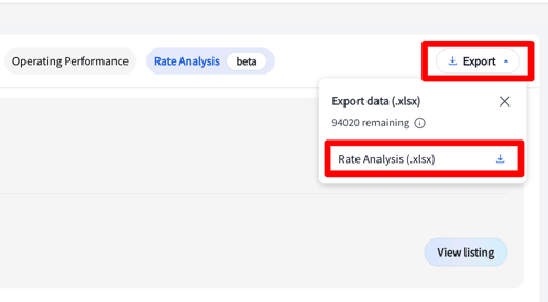
Downloading Your Custom Analysis
Once your chart looks the way you want it, hit Export in the top right and choose the Excel option to pull a raw data version of everything on screen. The first tab is the data table itself: every series you've built gets its own row (labeled by metric and by whichever breakdowns you applied, like unit size and climate control), with each time period running across the columns and a market average row at the bottom. The second tab documents the exact setup behind those numbers (your trade area radius, time range, rate settings, breakdowns, and any custom groups), so the export is fully reproducible and easy to hand off.
Questions?
We'd love to hear how you're putting this one to use, so send your feedback our way anytime. And if you hit a snag or want a hand building out a view, we're here and happy to help. Reach us at support@tractiq.com.